
スピーキングのDescribe Imageは大きく分けて以下の7種類の問題タイプがあります。
1.バーグラフ
2.ライングラフ
3.パイチャート&ダイアグラム
4.テーブル
5.地図
6.絵
7.フローチャート&ライフサイクル
ほとんどのタイプはテンプレートを使用することで簡単に高得点をとれます。試験を受ける前にテンプレートを使って入念に準備することをオススメします 🙂
Contents
バーグラフ・ライングラフ・パイチャートを完璧に
これらの問題はDescribe Imageの中で一番典型的な問題タイプです。そのためフォーマットを覚えておけば確実にスコアアップが狙えます。逆に絵のタイプは問題の種類の幅が広く対策自体が難しくなるため、あまり時間をかけることをおすすめしません。
バーグラフ
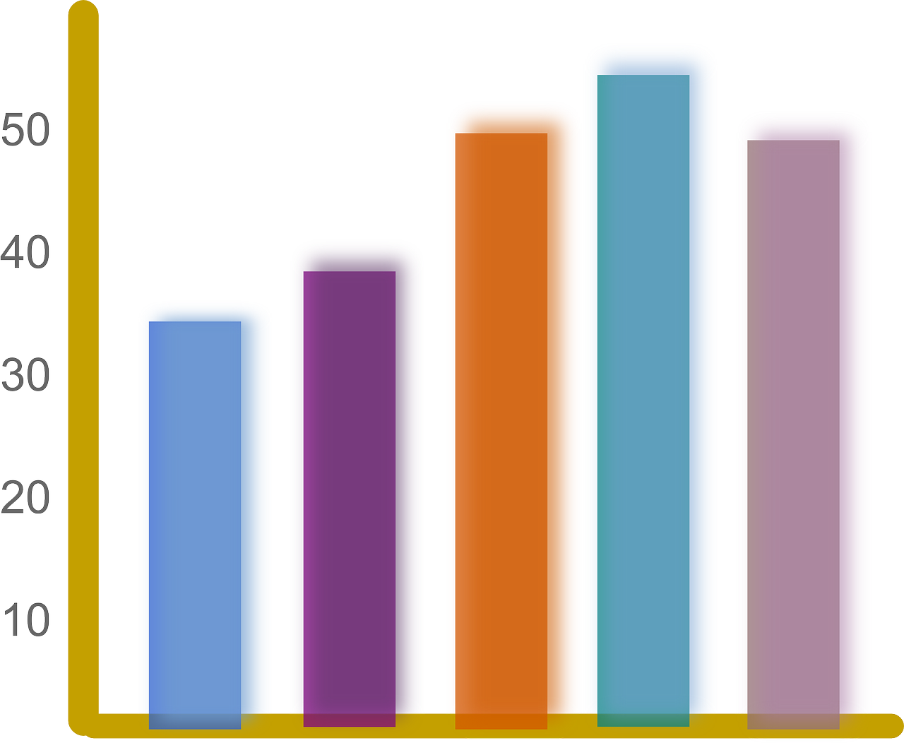
テンプレート
1.The data reveals statistical information regarding ~
2.The horizontal axis on the data shows ~ whereas the vertical axis illustrates ~.
3.According to the graph, ~
4.On top of that, ~
5.In conclusion, this data indicates that ~
ライングラフ

テンプレート
1.The data reveals statistical information regarding ~
2.The horizontal axis explains ~ whereas the vertical axis indicates that ~.
3.When you look at the graph, at the beginning of the ~, but at the end of the ~
4.On top of that ~
5.In conclusion, the graph tells us that ~
解答例
1.The data reveals information regarding monthly expenses year wise comparison.
2.Red line means online food recharge and blue one shows online mobile recharge while yellow line indicates online ticket booking.
3.According to the graph, online food ordering was the highest starting at 1500 and ending at 1700 in 2017.
Online mobile recharge was at 1000 in 2015 and decreased steadily to 400 by 2017.
5.Online ticket booking was 500 in 2015 but it went up to 1500 in 2017 close to online food ordering.
6.In conclusion, online food ordering and online ticket booking grew while online mobile recharge decreased.
パイチャート&ダイアグラム
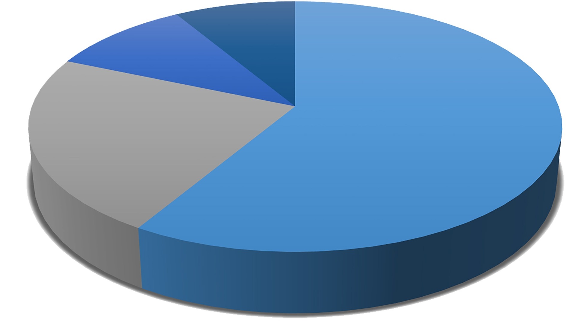
テンプレート
1.The data reveals statistical information regarding ~
2.Elements mentioned here are 1,2,3…
3.At XX%, A takes the largest percentage, which is followed by B at YY%.
4.C comes third at XX%.
5.On top of that ~.
6.In conclusion, A has the majority among all of the elements.
https://ptetutorials.com/sample-questions/speaking-describe-image
解答例
1.The data tells us information about Preferred Mode of Commuting.
2.Mentioned modes of commuting are metro, car, bike and local bus.
3.At 42%, largest percentage of people use metro as preferred mode of commuting, which is followed by bike at 24%.
4.Local bus comes third at 23%.
5.And finally, car comes fourth at 11%.
6.In conclusion, metro is the most popular mode of commuting while car is the least popular one.
テーブル
テンプレート
1.The data reveals statistical information regarding ~
2.The column on the left explains ~ whereas the right column indicates~.
3.In terms of the left column, ~
4.Regarding the right column, ~
5.On top of that ~
6.In conclusion, the table tells us that ~
解答例
地図
テンプレート
解答例
できなくても問題ありません。
絵
テンプレート
解答例
できなくても問題ありません。
フローチャート&ライフサイクル
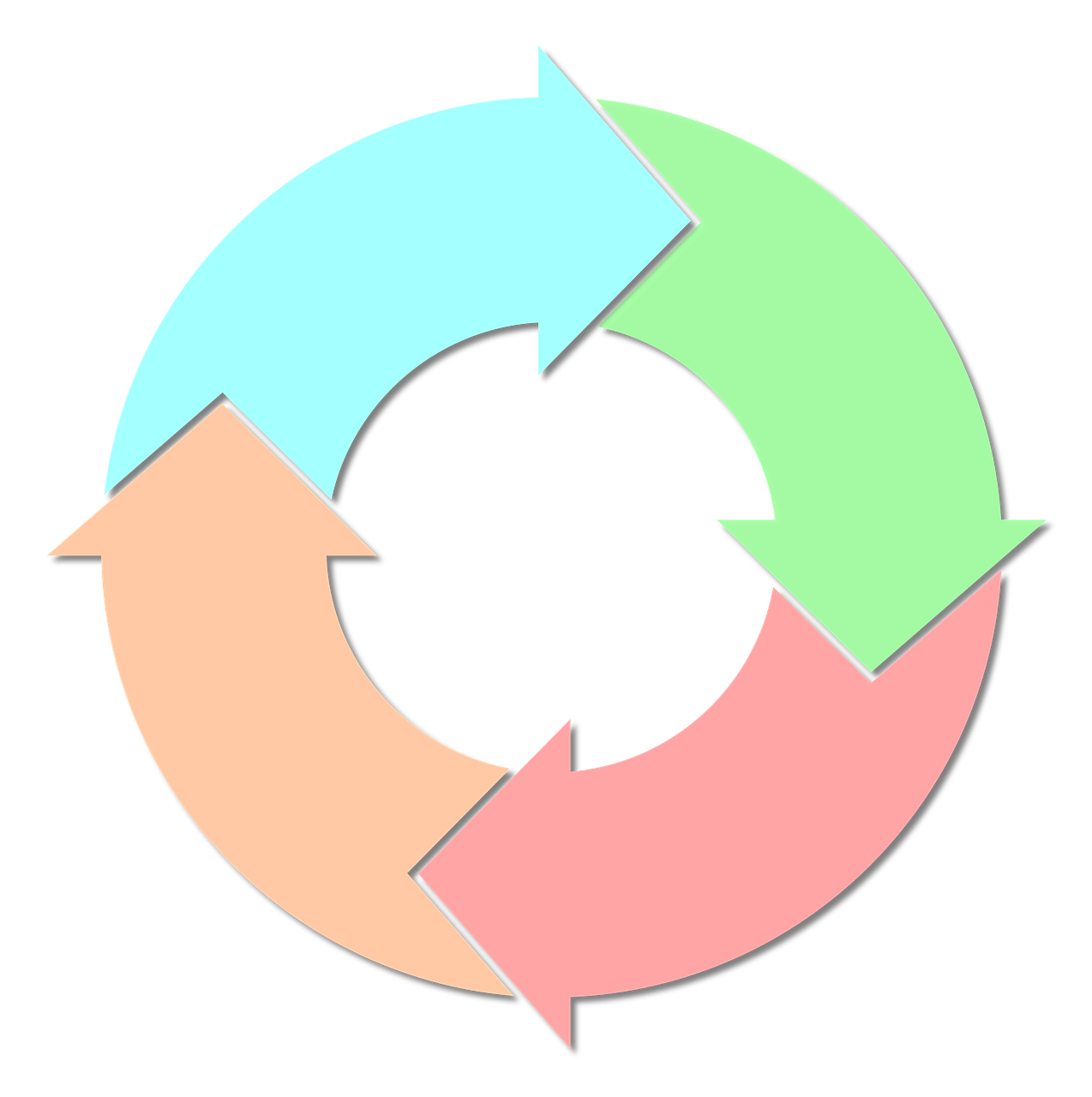
テンプレート
8.フローチャート&ライフサイクル
1.The picture reveals the cycle of ~.
2.It has X of steps, namely, 1, 2, ….
3.At the beginning of the cycle, ~
4.After that, ~
5.In the third stage,
6.The next stage,
7.Finally,
8.It conclusion, this illustrates that ~.
解答例
ご質問はLINE@までどうぞ

Be First to Comment